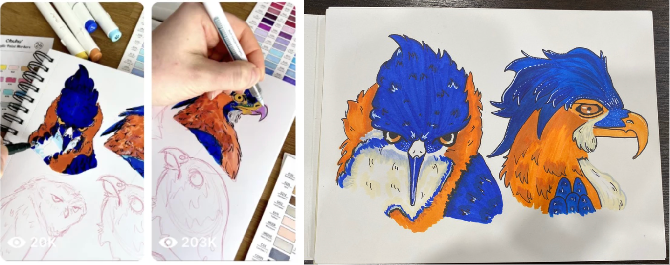
I always see these short art reels on Instagram and Facebook. They aren’t tutorials, just quick clips showing the artist’s process. I wanted to try following one because watching the process in a non-tutorial format feels faster and, in a way, more creative. Since you can’t see every step, it forces you to fill in the blanks yourself, which makes the experience a bit more fun and imaginative.
The Reel I Tried
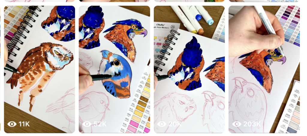
I discovered this artist through the two reels on the right and what drew me in first were her bright, vibrant colours. I also really love birds and want to learn how to draw them, so her work stood out to me immediately. The blue and orange palette especially caught my eye because they’re contrasting colours (thank you elementary school colour theory) and they make the artwork feel lively and striking. I also like how her birds have these almost human-like expressions in a quirky, charming way. The videos aren’t tutorials; they’re more like timelapses where she shows her process, which makes them fun and inspiring to watch.
My Result Following the Reel
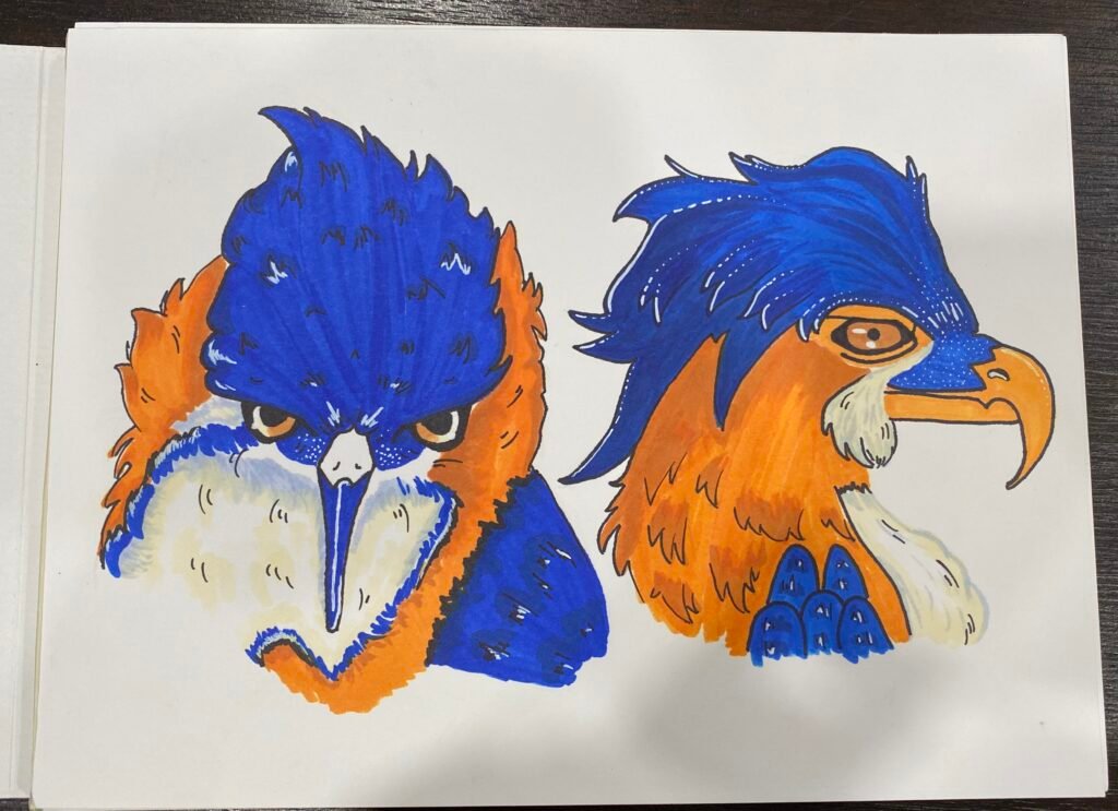
Overall, I really liked how it turned out, I love the image itself, and I’m honestly proud of how close I got to the original. Here are some of the pros and cons I learned while following this reel:
✅ Pros
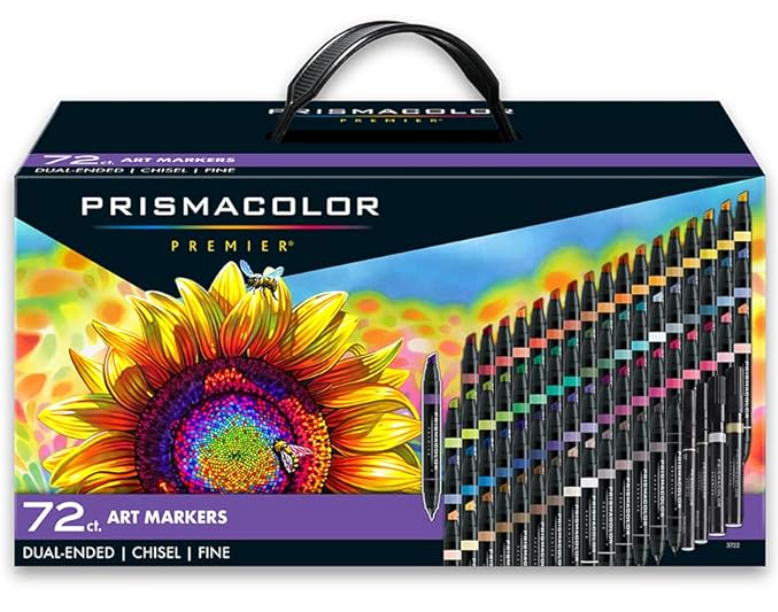
- The colours look so good together. Even though I didn’t have the exact same markers she used, the blue–orange palette still worked really well.
- The line work is actually simple to follow. The shapes are bold and clean, which makes the sketching part easier.
- Layering helps a lot. Because she shows each stage in the reel (even though it’s sped up), I was able to replicate the layering in a way that made sense.
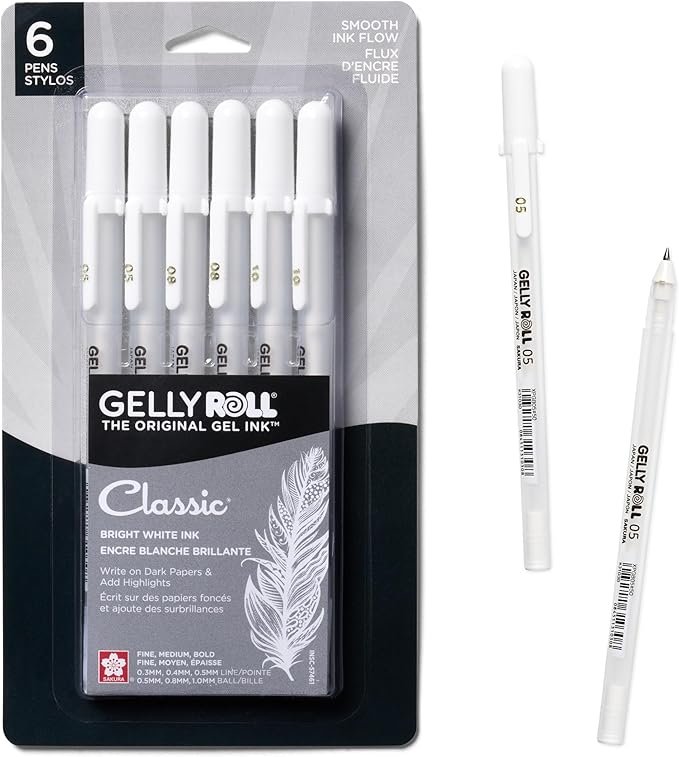
- I love the extra white highlights I added. They helped everything pop and gave the birds more personality.
❌ Cons
- Without a full tutorial, you don’t get to see the initial sketch. This makes starting the drawing harder, especially for proportions.
- I tried a beige fur/feather colour and it turned out okay, but the light blue fur looks better and fits the aesthetic more.
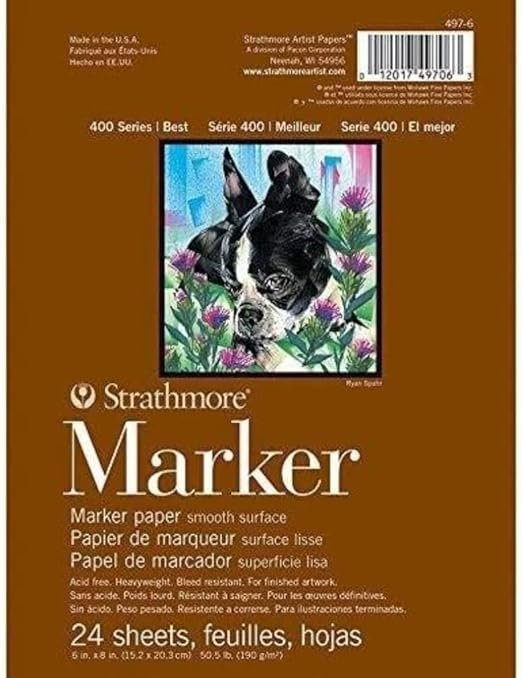
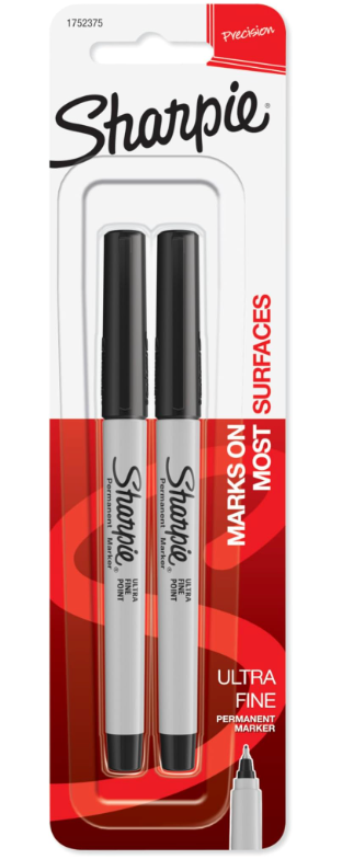
- I used a Sharpie for the line art, which wasn’t the best choice. On marker paper it bled a bit, so the edges aren’t as crisp as I wanted.
- The beak was hard to replicate. I wanted it to look longer, but proportion-wise it didn’t make sense and I couldn’t match the shape perfectly.
- Some parts of my marker work are streaky, which is pretty normal with alcohol markers but still something to improve.
(I show these problems in the photos below.)
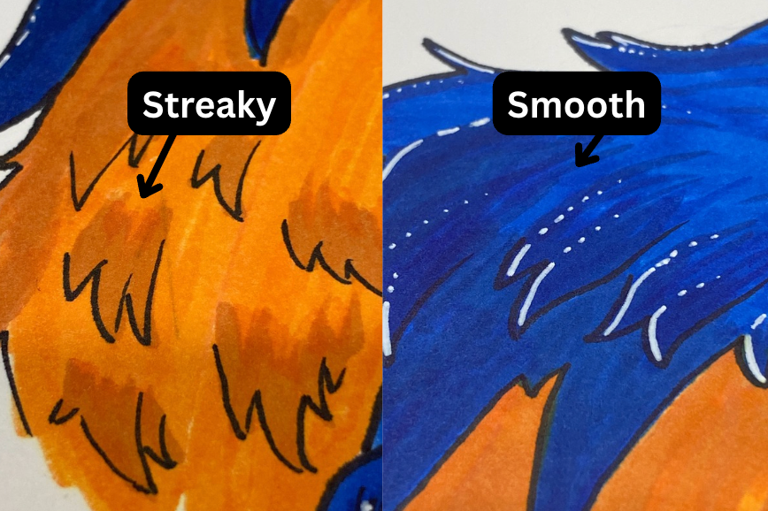
No transition colours:
The orange feathers look streaky because I didn’t have a good in-between shade to blend with. The blue areas turned out smoother since I just layered the same colour, definitely the better method when you don’t have matching transition colours.
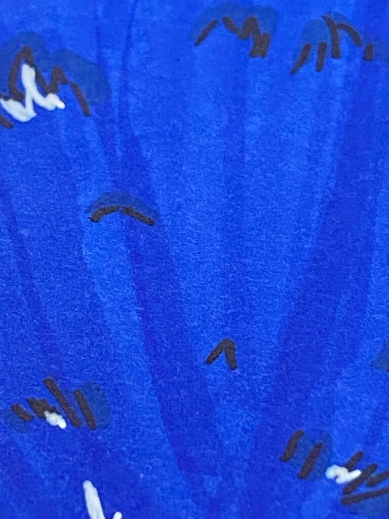
Streakiness:
In areas where it’s just one solid colour, I noticed some streakiness. I think this might be normal with alcohol markers, but I do wonder if there’s a way to prevent it. I notice this does not happen if I use alcohol markers in my sketch book but that may be due to the difference in paper? If anyone has tips, I’d love to hear them.
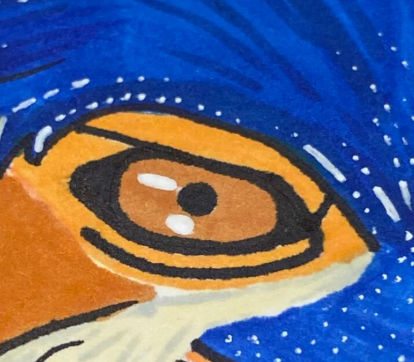
Sharpie bleeding:
It’s a bit hard to see in the photo, but the black line art looks like it’s bleeding out slightly, almost like a watercolor blur. I’m not sure if it’s the paper or the Sharpie, so if anyone knows why this happens let me know!
